MFA Painting Thesis
Spring 2024, Boston University
by James Gold


introduction
This Thesis project has allowed me to reflect on the processes, ideas, and artistic strategies that have most influenced my practice since arriving at grad school. According to my calculations, it’s been about 605 days, or one year and eight months, since our cohort received our First-Year studios at BU. This page includes images from those 605 days, showing my studio, my paintings, and my process, interwoven with writing about form and content.
Artist Statement
At once ancient and futuristic, my paintings depict fragments of hypothetical archaeology. Their lustrous surfaces are created with traditional painting techniques, yet are influenced by the hyperreality of digital imagery, occupying a space between fact and fable.
In my recent work, a papyrus scroll unfurls like a flag against a glowing coral background, an illusionistic black-and-white mosaic reveals swirling silhouetted artifacts, and an array of floating golden fragments on an electric-blue background suggests cartographic contours of islands and oceans. The cropped compositions imply that each painted object might extend infinitely beyond the edges.
My studio is an alchemical laboratory where I explore the sensuality of diverse materials. Starting with a sandy-textured pigmented gesso, I layer India ink, egg tempera, and sign-painting enamel in a range of shimmering colors, using stamps, brushes, abrasives, and calligraphy pens to realize objects that appear found, even to me. Viewers are invited into a world of “willing suspension of disbelief” as color and form become trompe l’oeil fragments of marble, tapestry, and papyrus. I create my paintings with love and care, and as I foreground an imagined future, I invite viewers to rethink the physicality of our contemporary world.
Each painting grows out of in-depth research and prompts investigations into an ever-expanding web of topics. As I read about archaeology, the history of design, neuroscience, geology, and the language of symbols, I gather and condense information into the surfaces of my paintings, driven by a desire to freely share the excitement of my discovery with viewers. This cycle of expansion (through learning) and compression (through making) allows me to cast a wide net, as I explore the question: What does our historical imagination look like?
Paint is a finely tuned antenna, reacting to every unnoticed movement of the painter’s hand, fixing the faintest shadow of a thought in color and texture.
— James Elkins, What Painting Is

substrate & materials
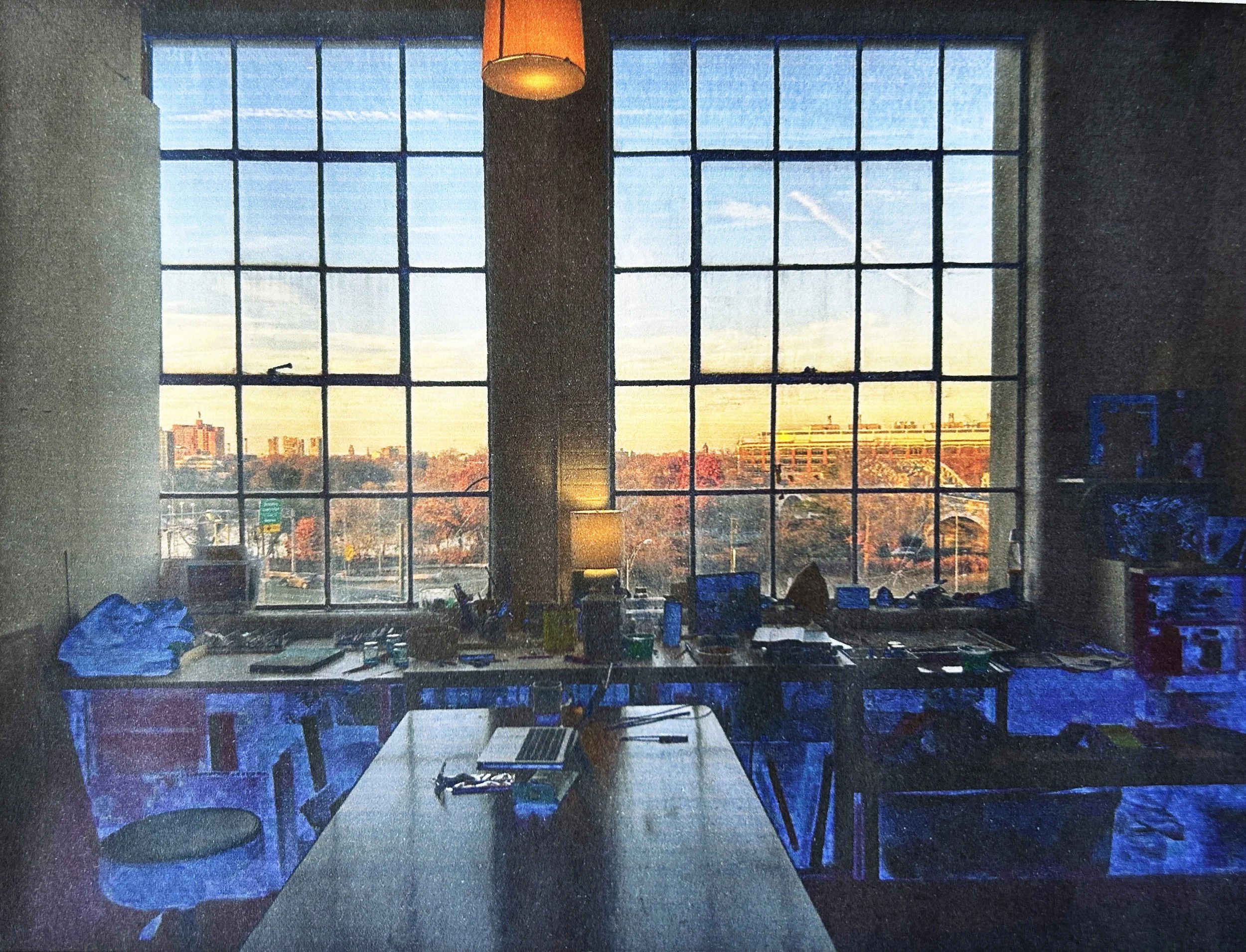
Starting with the most basic physical foundation of my paintings, I describe my chosen substrate (cradled wood panels), the sandy-textured gesso essential to my process, and the materials I currently use the most in my studio. At right is a typical selection of paint and brushes on my painting cart.

-
During grad school, I’ve found my ideal surface. In the 808 Wood Shop, I’ve gained the skills to construct my own panels of any size or depth, sometimes creating the cradle using found hardwood with appealing grains and colors, such as poplar, cherry, and oak. In the future I hope to afford such wood for larger panels, because when I’m holding a cradled panel made from beautiful pieces of wood, I feel even more excited to work on it, and using special materials almost seems like casting a spell to help the painting succeed. I also become more invested in salvaging difficult paintings when the stage of their creation is an especially nice panel that I’ve made with my own hands.
I’ve come to rely on the panel’s stability. By working on panel, rather than flexible canvas, I can use sharp objects to incise the surface, I can rest the weight of my body on the panel when I need to work on it horizontally, and it remains sturdy, steadfast, as I work – unlike canvas, which warps and distorts wherever one is actively working.
-
When it comes to preparing my substrate for painting, the particularities of the gesso I use are just as important as the nature of the panel. Thanks to Dani Levine’s Fall 2022 workshop, where she shared her knowledge and ‘trade secrets’ with us, I started using an increasingly textured gesso enriched with cellulose fiber (Arbocel) which adds a soft sandy texture to the surface. I initially made gesso with powdered pigments, which was a bit messy, and recently I’ve been mixing the Arbocel with Regal Select 100% acrylic paint from Benjamin Moore (colors like Smoke Embers and Deep Ochre) with excellent results. I’d like to befriend a conservator and ask them if there are any properties of this paint that would interfere with it being archival – although I’m always eager to know the rules about what’s archival and what’s not, I believe people are too quick to assume that non-archival materials are going to spontaneously crumble to dust in a few years. It’s not just ‘house paint,’ it’s ‘Benjamin Moore Regal Select Flat’! I definitely feel a sense of tension between wanting to follow ‘rules of best practice’ and an (often stronger) impulse to ‘see what I can get away with.’ I really like this gesso for now, because the matte finish is better than regular gesso, and I need a large quantity of gesso material, given that I apply a good half-gallon of the mixture to a medium-large panel.
I embrace the chance variations in texture that occur in the gesso based on how much material is on my brush and the relative humidity of the day. Later, when I’m working on a painting and use sandpaper or a dry-brushing technique, the gesso’s texture can produce surprising and pleasing effects. This sandy-textured gesso has the added benefit of enabling me to work larger and faster – whereas ultra-smooth gesso, which I used in the past, made me more slow and obsessive about picking out every speck of dust and hair. Finally, the rough texture lets me layer paint and ink in unusual ways that wouldn’t be possible on a smoother substrate. Once I’ve applied and lightly sanded five or so layers of this gesso, the panel is ready for painting.
-
In my BU studio I have been refining my technique of using my ‘trifecta’ of favorite materials: egg tempera, India ink, and acrylic gouache. I used to paint exclusively with egg tempera, then started adding an underpainting of India ink, and most recently added an ‘under-underpainting’ layer of acrylic gouache. All this layering is crucial to achieving certain color effects and surface textures, and it’s worth the extra effort in order to see certain colors created by optically mixing the transparent India ink and opalescent egg tempera over certain opaque base colors of acrylic gouache.
Starting from the bottom-most layer: the acrylic gouache (a term I use to encompass all the brands of matte acrylic paint) often has a chalky cast to the color, though Golden’s SoFlat line has perhaps as much saturation as can be coaxed from matte acrylics. I generally thin the paint to the consistency of heavy cream and enjoy how fast it dries – so I can keep working on refining a composition as long as I like, without the tedium of waiting for oil colors to dry. I never felt happy using those plasticky, shiny ‘Heavy Body’ type acrylics, but with SoFlat, it’s a whole new world.
Once this matte acrylic ‘under-underpainting’ is established, I’ll use the second member of the ‘trifecta,’ India ink from Ph. Martin’s Bombay line, which can be thinned with water yet dries with a completely waterproof surface, thanks to its shellac content. I also love Faber-Castell India ink brush pens for these same qualities, and although their small size makes them more suited for detail work, I am grateful to them for being the ‘gateway drug’ that first led me into the realm of India ink. Often the ink mark is slightly ‘harsh’ and I often make a mark, then smudge and soften it with my hand in the momentary window before it dries. When I’m glazing with the ink, it’s easy for a whole painting to become too dark, too fast – and often I’ll push the painting ‘too dark’ then scumble over areas with a lighter color of the acrylic gouache.
The topmost layer consists of egg tempera, the medium favored by artists before the advent of oil paint. I am forever grateful to an artist named Gian Berto Vanni (b. 1927, Rome) who, during my second year of undergraduate studies, introduced our class to this technique of painting with pigments in a binder of egg yolk. In his tempera demonstration, Vanni delicately cracked an egg, rinsed it under the sink and discarded everything but the yolk. He used a paper towel to dry his fingers while passing the yolk from hand to hand, and then showed us how to (in his words) “hold the yolk by the neck, like a kitten” to release the inner contents and discard the membrane. A splash of water and a drop of vinegar to ward off microbes, and the medium was ready to mix with an equal volume of pigment to create the freshly-mixed egg tempera paint.
These days, I mix the egg medium with tubes of watercolor or gouache, adding more or less water depending on the transparency needed in a given area. Egg tempera dries to the touch within minutes, and at this initial stage, it can still be wiped away with water – then, over the course of a few weeks, it becomes waterproof and polymerized from the oil/fat in the egg yolk. The egg tempera has all the luminosity of the ink, yet makes a more gentle, delicate mark (in contrast to what I called the ‘harshness’ of the ink). The egg tempera also has an index of refraction that is similar to that of oil paint – and the luminescent color, satin finish, and pearlescent effects are the perfect ‘icing’ on top of the other layers.
-
The material description above represents a working method that feels very ‘right’ to me, and I could imagine developing this ‘trifecta’ strategy for the rest of my life, though I’m open-minded about adopting other material approaches. In recent years I have experimented with laminating fabric onto panels (nice texture, not really worth the trouble) and mixed copious amounts of powdered graphite and mica into my homemade gesso. I’ve created matte fields of oil paint mixed with cold wax for the backgrounds of paintings, employed sign-painting enamel for marbleized effects, and explored many ways of working with paper for my books related to Richard Ryan’s Poetry Project. Playing with new materials can be invigorating though I have to be careful not to become too swept away by material experiments – I could see myself falling down a rabbit-hole of quilting or wood joinery with dowels, and it’s unclear whether such ‘side quests’ might benefit my painting practice in some oblique way, or just be a way of frittering away energy and time. Overall, I’m grateful for the constraints of using ‘paint-like substances on panel’ and feel like I have much to explore and discover within the limits of this terrain.
-

fabric fragment (2022)
Egg tempera and India ink on panel, 6.25 x 8.25 inches
This painting depicts a snippet of fabric billowing in the breeze, its golden and vermillion tones contrasting with the S-curve of deep burgundy at the bottom of the panel. Incised lines impart a crystallized precision to the surface.
-

elements (2023)
Oil enamel, graphite, mica, and pigmented gesso on panel, 11 x 14 inches
In this painting, I used the seductiveness of oil enamel to create a marbleized sphere (perhaps the globe of the Earth or a close-up view of a rare gem). This gleaming enamel surface contrasts with the powdery, matte ground of orange-red oxide pigment, graphite, and flakes of mica.
-

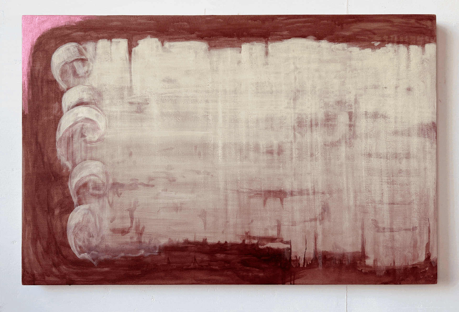
color study (2023)
Pigmented gesso, India ink and and acrylic gouache on panel, 6.75 x 10.5 inches
This illusionistic painting presents a color study partially hidden, partially revealed by shifting sands, perhaps conveying a sense of discovery and mystery as something buried is coming into the light.
-

Mosaic Discovery (2022)
Acrylic gouache and gesso made with graphite powder and mica on panel, 18 x 24 inches
This painting allowed me to play with the ideas of unearthing, overlap and layering: the sparkly gray ground of graphite powder appears to be overlapping the mosaic, yet it is the bottom-most layer of the painting.
-

Heraldry Duo / Night & Day (2023)
Egg tempera, India ink, and gesso on two panels, each measuring 20 x 16 inches
This pair of paintings explores the world of symbols drawn from a 17th-century encyclopedia of heraldry by Randle Holme. Emblazoned on the grids are a total of 360 miniature designs and tools, whose forms shimmer across the three panels. (There was also a third red panel. Usually I just show these two – a dusky twilight with low visibility next to the bright amber glow of sunrise.)
-

book palette (2023)
Oil enamel and India ink on panel, 8 x 12 inches
Inspired by a book of marbleized paper displayed at the Grolier Club, this painting skirts the line between fact and fiction. On the right side of the book, portals of marbleized oil enamel depict a variety of elemental forces.
Artistic genealogy
The fifty artists (and art/craft traditions, such as mosaic, quilting, inlaid marble) that inform my approach as an artist.
containers & form
Ursula Le Guin, who earned her PhD in experimental psychology before becoming a science fiction author, came to writing “lugging this great heavy sack of stuff” containing not only the personalities of potential characters but “tiny grains of things smaller than a mustard seed, and intricately woven nets… full of beginnings without ends, of initiations, of losses, of transformations and translations, and far more tricks than conflicts, far fewer triumphs than snares and delusions.” (169) In this essay titled ‘The Carrier Bag Theory of Fiction,’ she proposes that the novel is her ideal container or ‘carrier bag’ for her stories and ideas. Rather than regarding the hunter’s heroic sword or spear as the essential icon of human civilization, she champions the gatherer’s container as the true “tool that brings energy home.” (167)
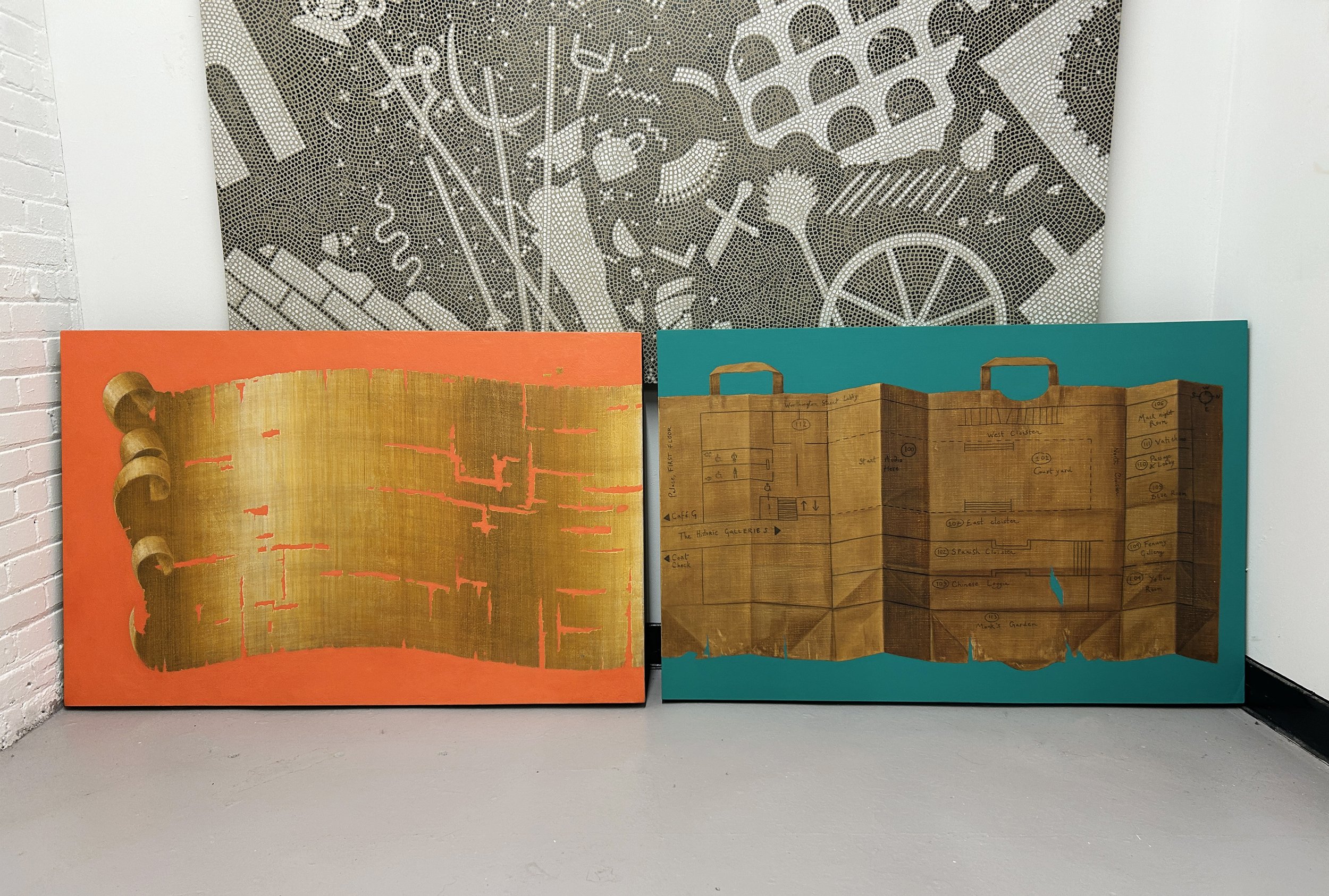
Papyrus Fragments (2023), Oil paint, India ink, acrylic gouache, and pigmented gesso on panel, 44 x 29 inches
-
This passage pushes me to consider the ways that my paintings function as containers, while often depicting vessels of various shapes, or objects such as scrolls and books that serve as repositories of knowledge and language. In many of my paintings there is a tension between ‘What is the container, and what is the content?’ – especially as I choose to paint something like a blank piece of papyrus. Perhaps this papyrus was never used, like the ancient Egyptian blank papyrus in the Met’s collection, or its text has been written with invisible ink, or all its previously legible letters and symbols have been carefully scraped from its surface.
The concept of ‘container’ also relates to my approach to composition. Sometimes the panel feels like a very exact container for the subject – as when the edges of a painted book or box align precisely with the edges of a given panel. Many of the paintings I was making in 2011–2022 referred to the container of a museum case and the idea of presenting an object for the viewer, often with a zone of empty space around the object in a contrasting color, like the fabric lining a vitrine.
My more recent work has moved towards compositional approaches of cropping, cross-sections, and the idea of an ‘all-over treatment.’ Ideally, the cropped compositions function by suggesting that a given object extends infinitely in every direction beyond the boundaries of the panel, presenting the viewer with a fragment of an enormous implied whole. The concept of the cross-section, in turn, suggests a supernatural level of vision, being able to see through layers much like an X-ray, but with different optical effects than the ghostly, medical connotations of traditional radiography. Finally, the concept of the ‘all-over treatment’ comes from my interest in mosaics, tapestries, quilts, and textiles – specifically, the way that these media create rich, energetic fields of pattern and colors. In some of my most recent pieces, I’m starting to have moments of disruption or slippage in the all-over visual activity and I’m curious where this might head in the future.
-
Regarding size, I’ve been working on larger panels (“bed-sized”) and continue to have an interest in smaller “book-sized” pieces. My approach to painting varies widely based on the size of a given panel. When I construct panels, I try to avoid sizes and ratios that ‘look store-bought,’ like 18x24, and often I use a Golden Ratio Calculator on the internet, type in the longer length of wood, then it calculates the ideal length of the shorter side. These are always overly ‘long, thin’ rectangles compared to what’s sold in art supply stores, so I use these measurements as a jumping-off point. I’m also into ‘off-square’ ratios and recently made a 22” x 20” panel. Sometimes I make a panel for a specific painting composition, but more often than not, the panel comes first and I ponder its size in relation to my ‘well of painting ideas’ and it’s more of a match-making process, which feels more natural to me, although I’m perfectly happy to construct a panel to an exact size when it’s necessary.
The panels I’m currently using are rectangular, although I spent many years working on odd-shaped geometric pieces of plywood and tondos. I kept getting so many questions of “Why that shape?!” and felt like my options for composition were stifled in a way that was frustrating – so it’s another case of joyfully welcoming the ‘limitation’ – the rectangular format – which ultimately feels supportive, a stable piece of ground in all the potentially shifting sands of a studio practice.
-
I’m intrigued by the possibilities of showing very small works side-by-side with large paintings, and despite my interest in a variety of sizes, my interest in scale seems fixed in a certain register, where items are about 125% of their actual scale.
I find my brain and hand need to work at a certain constant scale of resolution, no matter how large or small the substrate. A 9” x 12” painting can take just as much time as one that spans twelve square feet – I just peer a bit closer at the tiny one as I work.
My painting ‘Mosaic Glass Fragments’ was an odd meditation on scale: it was inspired by a piece of ancient glassware at the Met that I’d never seen in person. Being in Boston, I couldn’t just hop on the subway to see it, so I painted it at a 1:1 scale using the website’s measurements. When I went to go see it ‘in the flesh’ a few weeks later, the actual object seemed far larger, darker, and heavier than I had painted it. The formal qualities of the painting are nice enough, though I largely see it as an exercise in relating my imagination (and the digitized information of a museum archive) and later reconciling that mental conception with my direct impression and lived experience.
Mosaic floorcloth (2022)
In How Do We Look, Mary Beard describes the ways that painting and sculpture were fully integrated into daily life in the ancient world, not considered a separate category of ‘art object’ to be housed in a gallery or museum, as they are today. She notes that “the question of where to draw the line between art object and the day-to-day living world is a common preoccupation of both artist and viewer,” (Beard, 147). Some of my pieces, such as my mosaic floorcloth, do extend into the day-to-day living world — I really enjoyed seeing classmates walk on the durable surface of this floor piece while it was on display.
-
The Mosaic Floorcloth came about because I wanted to make an installation in the ‘Flex Space’ off Town Hall for our first Group Crit. I had made a mosaic floorcloth in August 2022 and at the time, didn’t think it had anything to do with what I’d be pursuing in grad school. But then I became obsessed with the idea of making another one, just for this room, and that it would be based on a very beautiful Roman floor, black/white mosaic with inlaid pieces of marble. I kept trying to talk myself out of working on it, then kept looking at canvas prices late at night, working out how big it ought to be in relation to that space.
I stamped it in about a week, it did take all my waking hours, and most of the colored stones I painted right before the critique, but I was happy with how they came out. I did a few slowly (i..e, the faux porphyry) and then the speed/anxiety definitely helped me come up with some unusual color combinations and patterns for all the other little stones. If I were doing this piece over, I’d include more pieces of colored marble, like the original Roman one, but when I had sketched it out, it had looked full enough.
The Roman floor was called ‘lithostrotum’ and I searched far and wide and could only find one original image (from a big book about Mosaics), I wish I could see more examples, but the motivation of the project was to be able to see it with my own eyes, and to own it and share it with others.

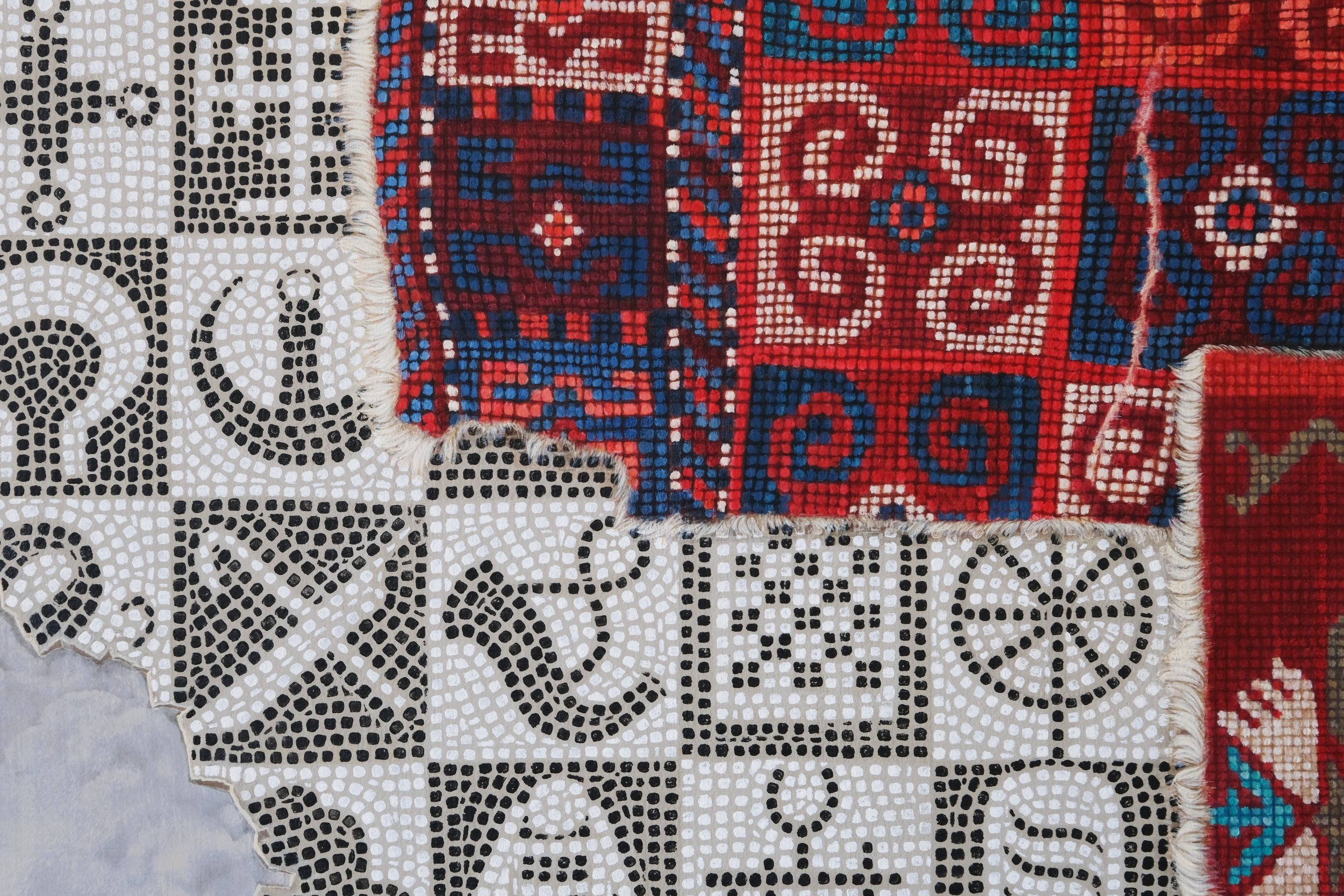
papyrus scroll on coral (2023)
When I was working on this painting, I periodically took photos of the different stages of the piece, and here is an animation of the various layers coming together. Below is a bit more writing about the process of creating this work on panel.
-
This large painting of a papyrus scroll curling and unfurling (as if animated by its own energy) is equally influenced by the Sienese painters of the Quattrocento, and by the precision of Holbein and contemporary computer graphics.
The 29” x 44” panel on which it was painted was, in fact, the first panel I created in the BU 808 Wood Shop. Becoming confident in creating my own cradled wooden panels, and using the router to make perfectly flush edges, is one of my personal accomplishments in grad school. I feel able to create panels of any size or dimension and have also acquired a router and miter saw so I can keep making my own surfaces after graduation.
This particular panel was fabric-wrapped, gessoed with the “Dani Levine” pigmented gesso, and I had tried making several paintings on the surface (first a storm of fragments in orange on a purple-gray background, then a twisting papyrus scroll, then a close-up of the mosaic glass vessel on an orange background), all of which all I deemed unsatisfactory or unappealing, and they became hidden under the present composition. I don’t usually have so many buried or failed paintings hidden underneath – yet the heft of the panel (it’s topped with unnecessarily thick ½” plywood and has at least a pound of gesso on the surface) and the effort I’d invested in building it, and creating the surface of fabric and gesso, made me motivated to “make it work.”
I had wanted to re-visit the composition of a curling and disintegrating papyrus that I had created in Fall 2022 (pictured in the Appendix of Failures) and it makes sense that this panel, already the site of so much re-working, would be a home for a revision of that painting. I wanted to have a cropped composition (implying that the scroll might extend a good 200 feet to the right of the panel), a brighter coral background, and overall to have the papyrus feel fresher, and less ‘dirty’ and tattered. I also became fixated on the idea of the new composition echoing the Emoji Flag format, and I glanced at the emoji as a reference while developing the painting. The concept for the new composition came to me upon waking up on our first morning at Hewn Oaks – it is always the best feeling to wake up with a new, clear painting idea!
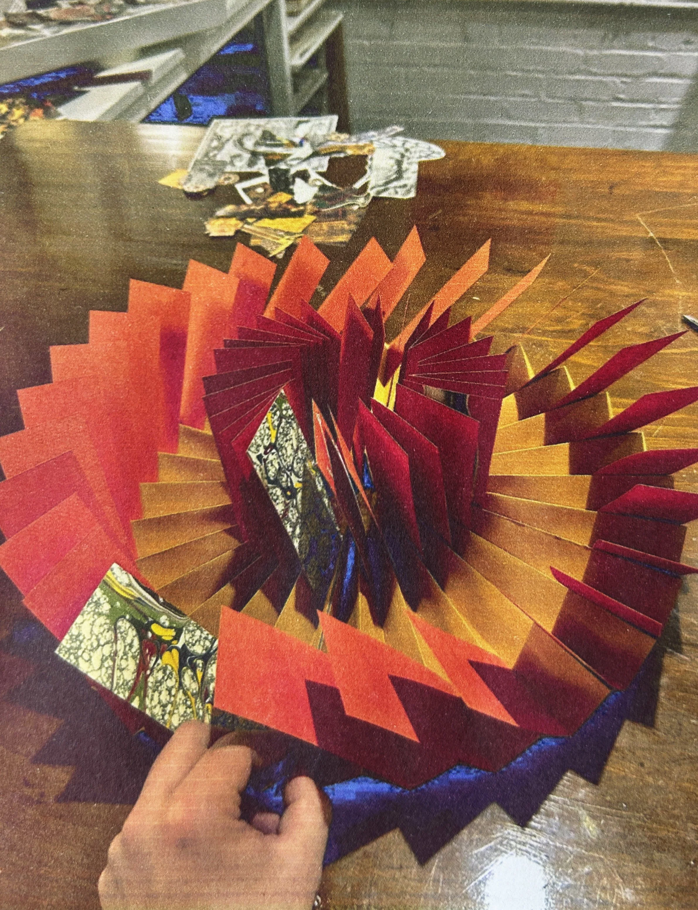
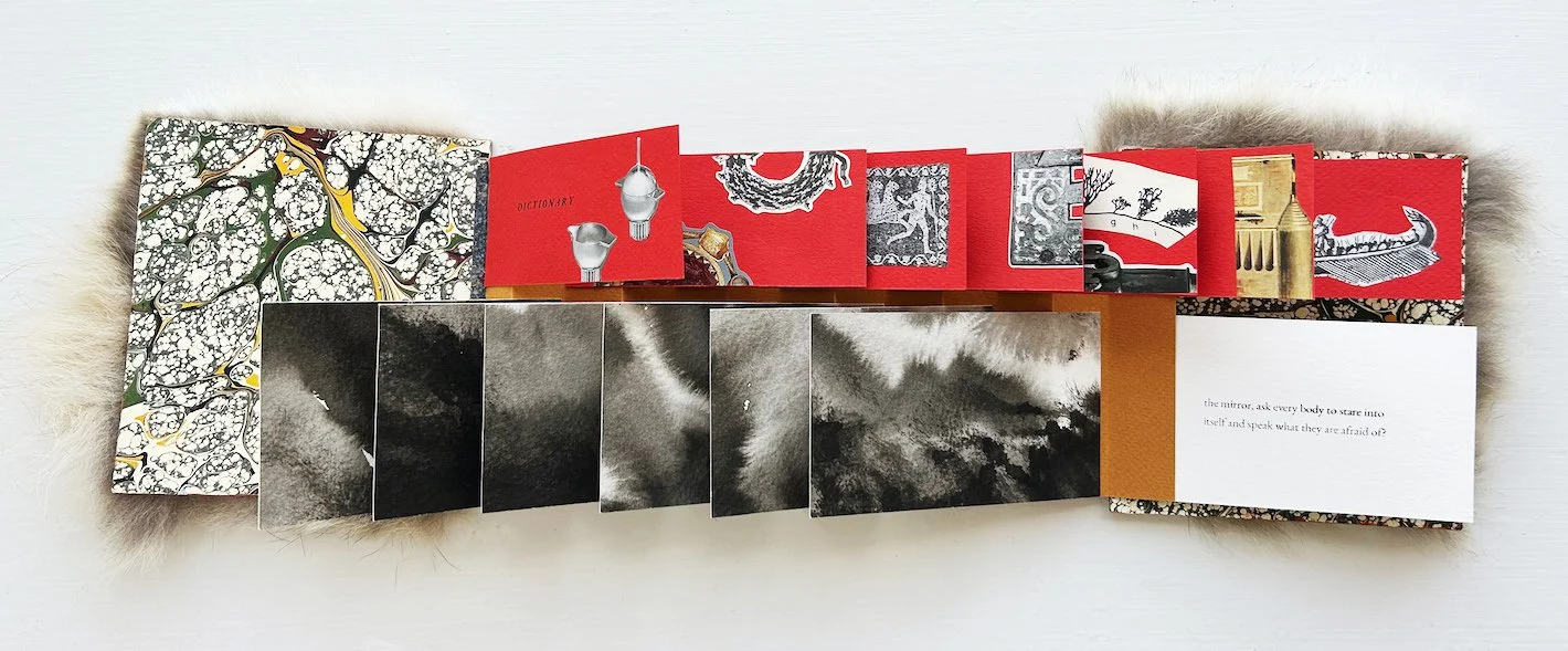
experiments with book-making and collage
Below are some images of a ‘flag book’ bound in fox fur. I made the book an edition of two for Richard Ryan’s Poetry Book Project in Spring 2023, in collaboration with poet Annaka Saari, whose six-couplet poem is featured, alongside collage fragments. With the leftover pieces from this project, I constructed another, larger flag book (shown at right during construction, and selected spreads shown below.)


2024 Collage Book Project


“The appendix of failures”
Despite the title (drawn from a phrase from Seminar Class), I don’t really think of all of these as total failures – just a collection of different approaches I tried over the course of grad school. It contains images of almost everything I made (or started) from September 2022 through February 2024, to be updated again after this final semester is over.
bibliography
-
Ahmed, Sara. Queer Phenomenology: Orientations, Objects, Others. Durham: Duke University Press, 2006.
Benjamin, Walter. "Unpacking My Library." In Illuminations, edited by Hannah Arendt, translated by Harry Zohn, 59-67. New York: Schocken Books, 1968.
Bennett, Jane. The Enchantment of Modern Life: Attachments, Crossings, and Ethics. Princeton, New Jersey: Princeton University Press, 2001.
Bennett, Jane. Vibrant Matter: A Political Ecology of Things. Duke University Press, 2010.
Cline, Eric H. and Glynnis, Fawkes, Three Stones Make a Wall: The Story of Archaeology. Princeton, New Jersey: Princeton University Press, 2017.
Crary, Jonathan, Scorched Earth: Beyond the Digital Age to a Post-capitalist World. New York: Verso, 2022.
Delacroix, Eugene. Journal of Eugene Delacroix. Translated by Walter Pach. New York: Crown Publishers, 1948. p. 68.
Eco, Umberto. Faith in Fakes. New York: Vintage Books, 1986.
Elkins, James. What Painting Is. New York: Routledge, 1998.
Elkins, James. "Re-enchantment Seminar." University of Chicago, 2007.
Hartman, Saidiya. "Venus in Two Acts." Small Axe: A Journal of Criticism (2008). Indiana University Press.
Hokusai, Katsushika. Mad About Painting. New York: David Zwirner Books, 2023.
Lakoff, George and Mark Johnson, Metaphors We Live By. Chicago: University of Chicago Press, 2003.
Lakoff, George and Mark Johnson, Philosophy in the Flesh: The Embodied Mind and Its Challenge to Western Thought. New York: Basic Books, 1999.
Le Guin, Ursula K. "The Carrier Bag Theory of Fiction." In Women of Vision, edited by Denise DuPont, 165-170. New York: St. Martin's Press, 1988.
O'Donohue, John, John Quinn and Krista, Tippett, Walking in Wonder: Eternal Wisdom for a Modern World. New York: Convergent Books, 2018.
Sillman, Amy. Faux Pas: Selected Writings and Drawings. After 8 Books, 2020.
Tarkovsky, Andrei Arsenyevich, Sculpting in Time: Reflections On the Cinema. Austin, TX: University of Texas Press, 1987.
Vallejo, Irene. Papyrus: The Invention of Books in the Ancient World. New York: Alfred A. Knopf, 2022.
Winchester, Simon. Knowing What We Know: The Transmission of Knowledge: From Ancient Wisdom to Modern Magic. New York: HarperCollins, 2023.
What’s Next? (Future Directions)
-

Archaeological dig
Thanks to my amazing archaeology professor at BU, Andrea Berlin, I’ll be helping out at an archaeological dig on the island of Cyprus, mostly making drawings of artifacts!
-

Residencies
In September 2024 I’ll head to Mass MoCA for a month-long residency, and will continue applying for other residency opportunities.